
It's been a while since my last blog post. I wrote last time that I had moved from Chiba to Niigata. Between clearing out my old place, the effects of my depression and other things, I was a bit swamped, and the blog went quiet.
Now, on to v1.1.8. This update takes in the comments I received on YouTube and the results of the survey that users answered. In broad strokes, it comes down to the following:
- Support for dotted note rhythms (modulation and more) (from YouTube)
- Support for light mode (the official site supports it too) (from the survey results)
First, thank you for your feedback. I've mentioned it somewhere before, but as the developer of IMFMSynth I am an engineer first, and I'm actually not that knowledgeable about music production. I'm studying so that I can keep releasing IMFMSynth responsibly. Because of that, IMFMSynth depends heavily on what users tell me, and I'm very grateful for your input in raising the quality of the product.
Below, I'd like to describe what I paid particular attention to this time, especially in the color design. I also wrote this in an earlier blog post, but considering color vision diversity is important. Anyone who has done design, on the web or elsewhere, will understand that a light theme and a dark theme do not simply work by reversing everything you did for the other. Rather, there are many elements that each have to be approached with a different way of thinking.
So this time, the UI colors ended up almost completely redesigned. A change that is small to some people is a big deal to others (and to me).
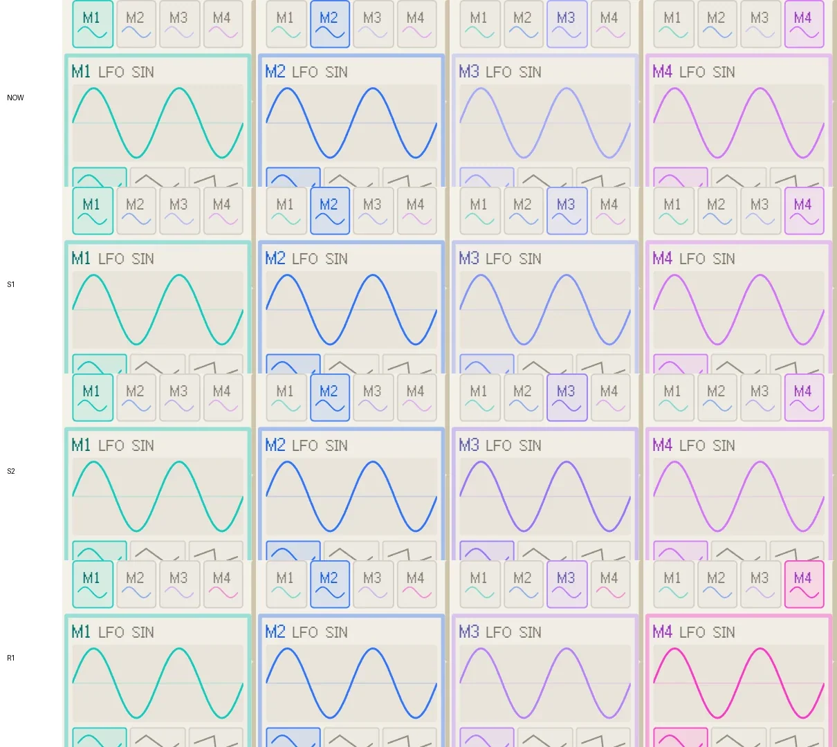
I made dozens of variations for several UI components and tested them. What I've posted above is just one of the multi-stage tests, and it covers only modulation.
The v1.2.0 update will have even more things to tell apart, so I consulted a colleague from my day job who joined the company the same year as me and knows accessibility well. They taught me a lot about color palettes for industrial use that take color vision diversity into account, and about ways of telling things apart other than color.
In closing
No matter how good the features of an app are, it means nothing if it isn't easy to use. This is something programmers like me tend to forget. It's like amino acid balance. An app is judged on many criteria, and if one of them is lacking, the overall score is dragged down sharply by that weak spot. That's how it is. With the UI in particular, it means letting the wishes of users who wanted to use the app slip through. We are now in an age where anyone can make an app with AI, but not everyone can make a good app. We must not forget whose wishes we want to fulfill, and how many people we can be there for. It is not easy. This time I read through several papers on color vision, measured numerically how easy colors are to tell apart, and then adjusted them with my own eyes to design the UI colors.
I intend to keep developing carefully and steadily. v1.2.0 looks like it will be a little difficult and take time, so please look forward to it.